Behind the Build
Role: Sole Designer, Developer & Writer
Timeline: 4 months (May - August 2025)
Project Background
Tools: HTML, CSS, Figma, Canva
My time at ACC sparked my passion for user-centered design. In summer 2025, while awaiting the start of my UX bachelor's program at St. Edward's University, I set out to create a personal portfolio site to both showcase my work and practice UX principals.
During my HTML/CSS micro-credential at ACC, I built a simple personal website to demonstrate my coding fundamentals. It was this project that I used as a foundation for the version you're seeing now, a fully responsive, accessible, and user-focused site that reflects my skills in both HTML/CSS and UX design.
Goals & Challenges
When starting this project, I wanted to refine my HTML/CSS skills enough to translate my vision into a functional site. To troubleshoot layout issues, internet sources such as w3schools.com and, when an issue gets especially knotty, AI tools have helped me come up with solutions.
This was also one of my first large-scale UX design projects. By simply exploring and interacting with the portfolios of other UX designers, I observed UX principals in action and gained a better understanding of current industry standards.
Wireframing
Why Wireframe?
While building this website, I had also been taking the Google UX Design certificate on Coursera, where I learned how to wireframe and its benefits to a project's workflow.
I wanted to apply what I had learned to this project and it helped me test my layout ideas, allowing me to settle on a layout I liked in just one day-long cafe session, saving me potentially days or even weeks of testing my ideas through code.
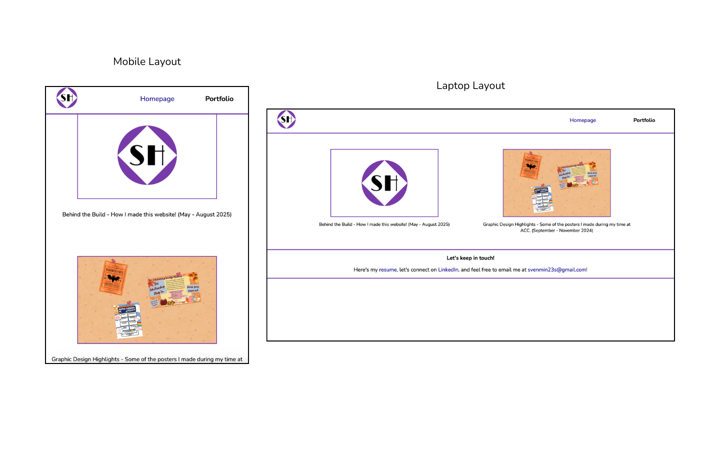
Overall Website Layout
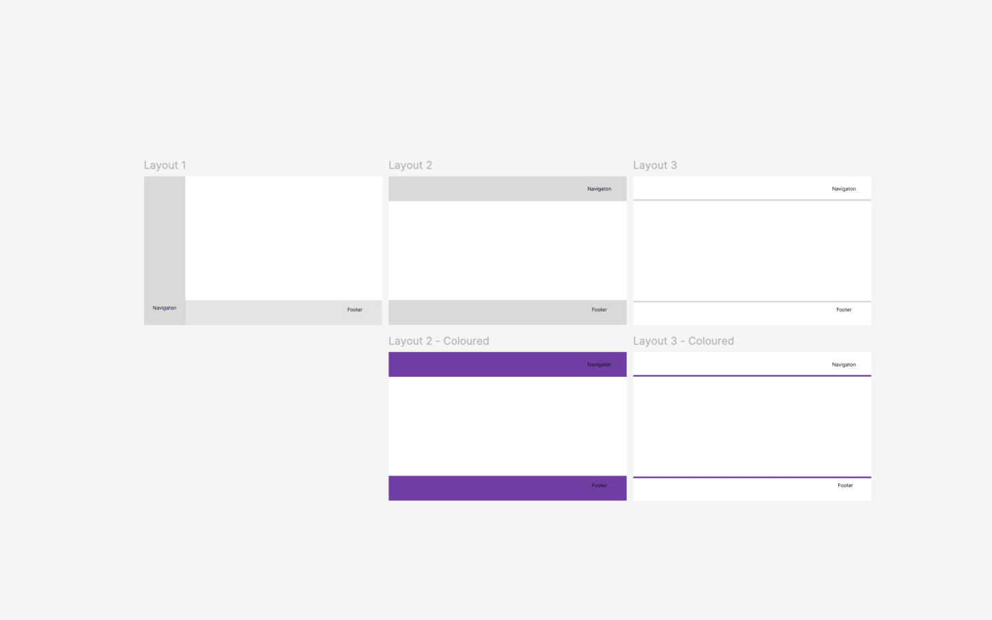
The layout choices I primarily concerned myself with was the location of the navigation bar, and the look of the header and footer.
For the nav bar, how would I list my webpage links? Vertically or horizontally?
It ultimately came down to the fact that my website would, for now, only have two links in the nav bar, the Homepage and the Portfolio. This meant listing my pages horizontally (side-by-side to each other) was a more efficient use of the screen space without looking cluttered.
Then I had to decide how I wanted the header and footer sections to look. I had been deliberating between blocks of my jewel purple colour or a simple line that separated them from the body.
I ended up going with a simple line as it looked more refined and prevented the purple from dominating too much in pages with less content.
Homepage Layout
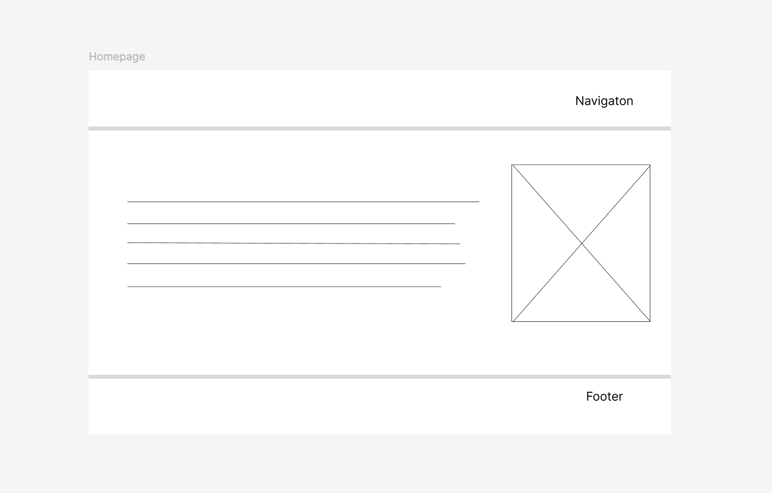
For my homepage, I decided to put an introduction/about me section next to a picture of myself. I decided to put the "about me" text to the left as I wanted that to be the main focus, while the picture is a nice touch to add a more personal touch.
Portfolio Layout
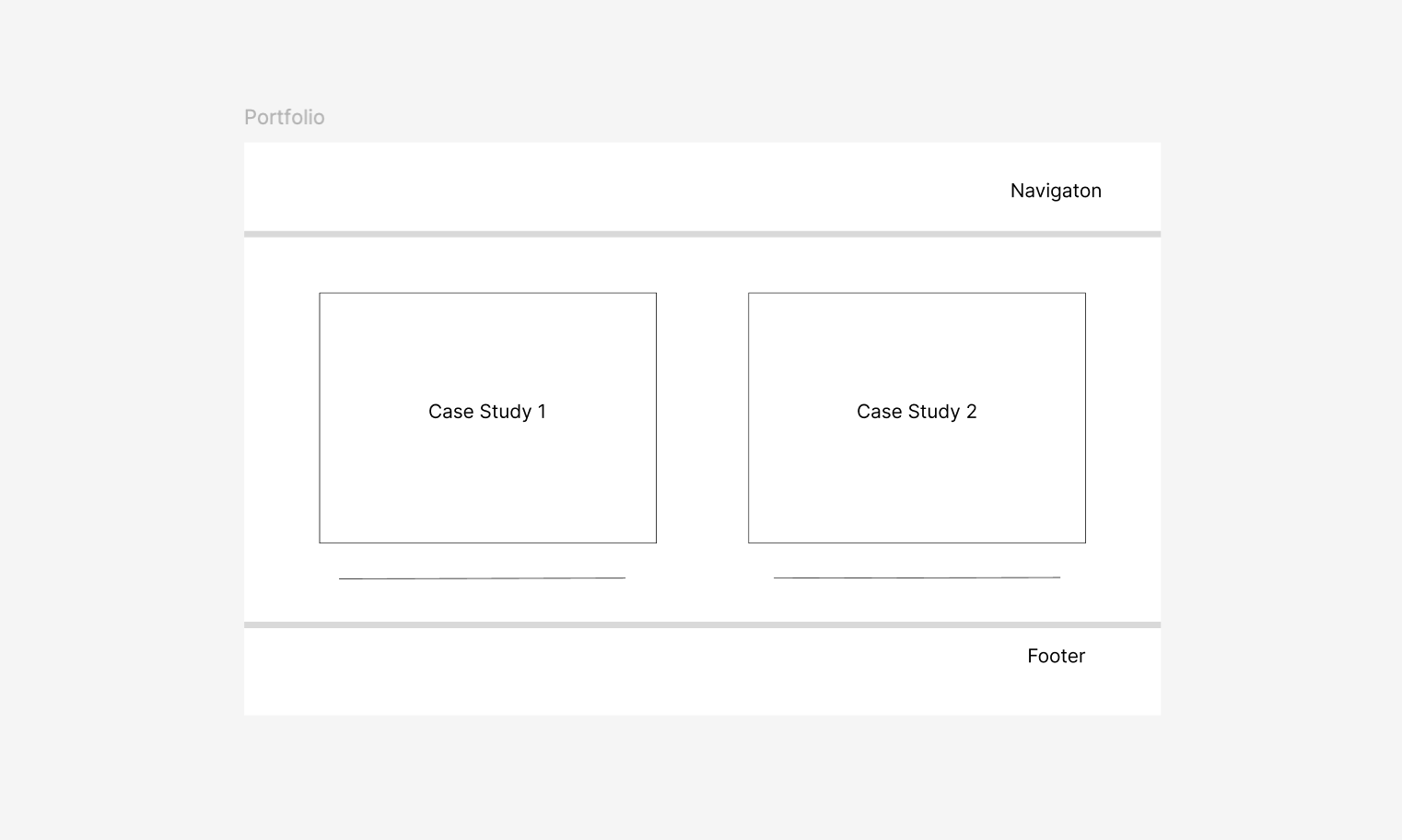
For my portfolio page, I decided to list my case studies in a two-column grid with associated pictures that linked to the case studies and a short descriptive text beneath them.
This was the layout I observed most often in the portfolio of other UX designers so emulating them felt like a good choice as something employers are used to navigating with. I also put a thin border around the images to slightly differentiate them from other images in the website.
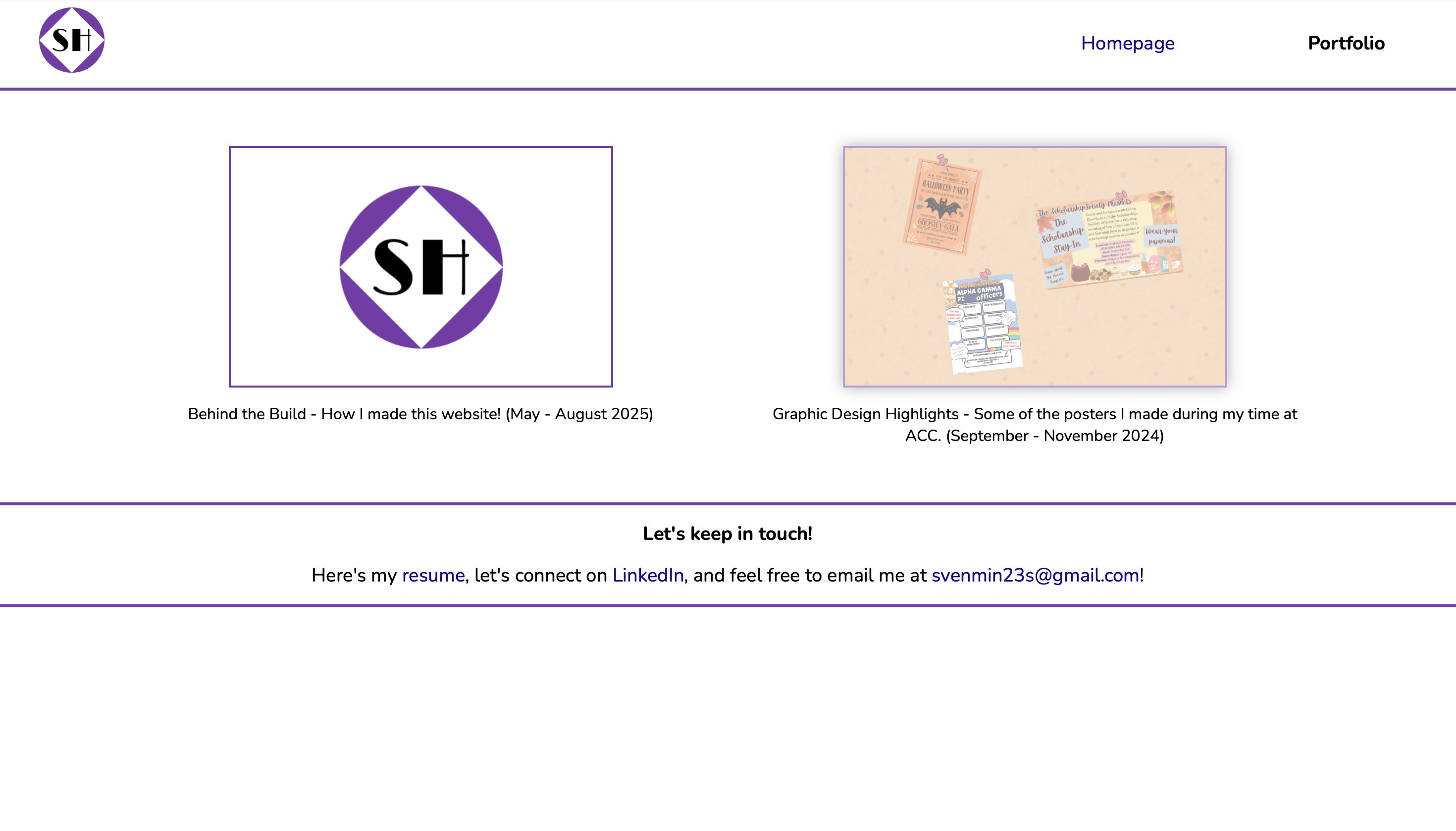
Case Studies Layout
I followed an "image with accompanying text" layout for my case studies. Apart from simply being a classic, it leaves plenty of space for the images/visual elements to be seen, and scaled down well to smaller screens.
Visual Design
Colour
Fun fact about me, half my closet consists of purple clothes and accessories. It was only natural I chose purple as my signature accent color for my website.
I narrowed it down to a jewel purple, as it looks professional while keeping my personal tastes and contrasts well with the white background.
Font
Nunito was my go-to font for this website, with Lucida Sans, Arial and sans-serif as fallback fonts.
I wanted something that felt professional yet approachable, Google Fonts was where I had spent most my time font-hunting, and I settled on Nunito. Its sans-serif and more rounded look struck that balance between business and personability I was looking for.
Optimizing User Navigation
On the nav bar, I decided to make the name of the page the user is currently on a bold black text, contrasting with the standard purple link of the website. I found this to be an elegant way to show users where they currently are.
Personal Logo
I designed my own personal logo to go to the left of the nav bar, a very common layout in the portfolios of other UX designers.
A simple circle encasing a white diamond, which itself encased my initials "SH" in the font Limelight. As someone who loves fashion history, the font's art-deco inspired style struck that balance of sophisticated, chic, and distinctive yet professional perfect for my personal brand.
Accessible Design
I made my website accessible by making sure I had fallback fonts, all images had alternative text, making sure the web default 16px font size was accessible and not using any sizes below that, and checking color contrasts on webaim.org, making sure they meet WCAG standards.
I not only tested that my jewel purple for accents was accessible, but also its faded variant I used for hovering over hyperlinks, and also the shade of shadow I used when hovering over links to case studies.
Responsive Design
For smaller screens, I made the website change in the following changes:
The homepage layout transformed from left-right (text-image) to top-bottom, and the same thing was done for how my case studies were listed in my portfolio page, turning it into a singular column layout.
I also switched from left-aligned to center-aligned text for the "about me" section on the homepage, which looked sleeker for a stand alone text.
I then noticed the nav bar hyperlinks looked too cluttered on smaller screens. I remedied this by simply allocating more column space to the hyperlinks for smaller screens, making them feel more appropriately spaced out.
Feedback & Iterations
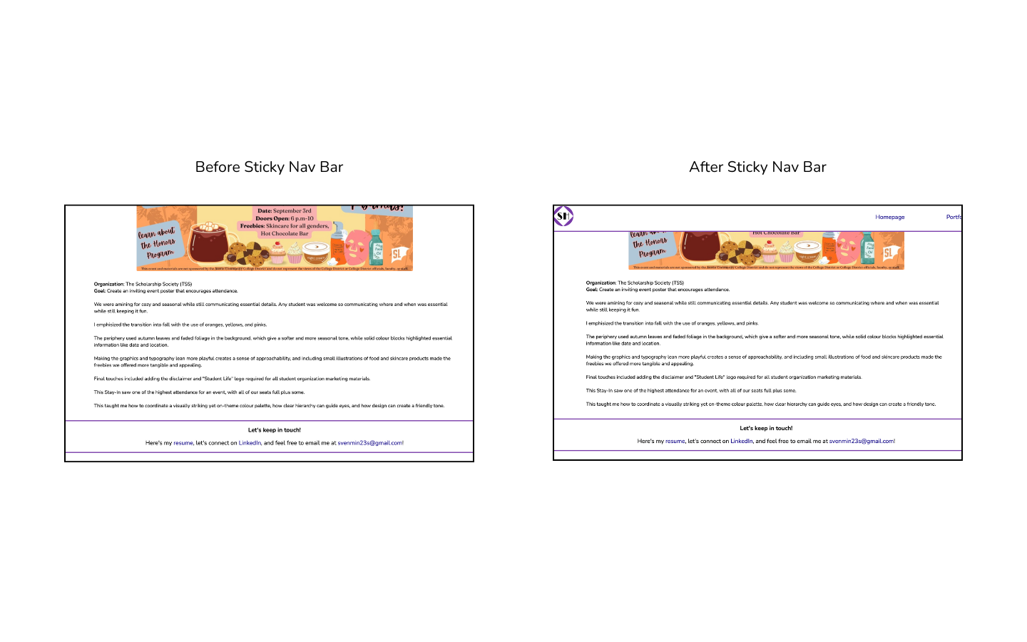
I had gotten feedback from five friends, all from college, in what you could call an informal usability test. Of the five, I got on call with two of them as they shared their screens to let me see how they navigated the website, and the other three sent me back some written feedback via text.
I had three people point out it felt just a little tedious to be scrolling back up to the nav bar to after scrolling all the way down my case studies, the lengthiest of my webpages.
So, I decided to implement a sticky header, one that stayed in the same position on the screen no matter how far down a user scrolled down the page. This meant the nav bar would follow the user as they scrolled down, eliminating the need to scroll all the way back up.
Final Reflections
This project has been invaluable as an opportunity to develop my HTML and CSS skills, and start applying UX principles and workflows for the first time.
I gained experience in integrating intentional design via user-centered thinking while keeping to a tight deadline. It was a chance to reflect on my own design thinking in both past and current projects, gain familiarity with industry standard tools and practices, and really get a glimpse into what my future work could look like.
And last but certainly not least, I now have a space where I can display my work to future employers and peers that shows off my personality, designing thinking, professionalism, and willingness to learn.