Enhancing MyMoney Five
Role: UX Designer & UX Writer
Timeline: 3 months (May - July 2026)
Project Background
Tools: Figma
Final Hacked Prototype
My goal was to improve the "MyMoney Five & Tools" section of the "MyMoney.gov" website. I wanted to make financial education feel more approachable to users with limited financial knowledge. Through UX audits, written content refinement, and navigation redesigns, I honed in on creating a frictionless experience and sustaining the motivation to learn for users.
Please note that because financial content is highly regulated, the proper production version of this project would be made in collaboration with compliance, legal, and financial professionals. My role was to design the information architecture and UX writing, not give personal financial advice or determine financial policy.
Identifying the Problem
The initial UX audit revealed several key points for improvement:
Confusing Information Architecture (IA)
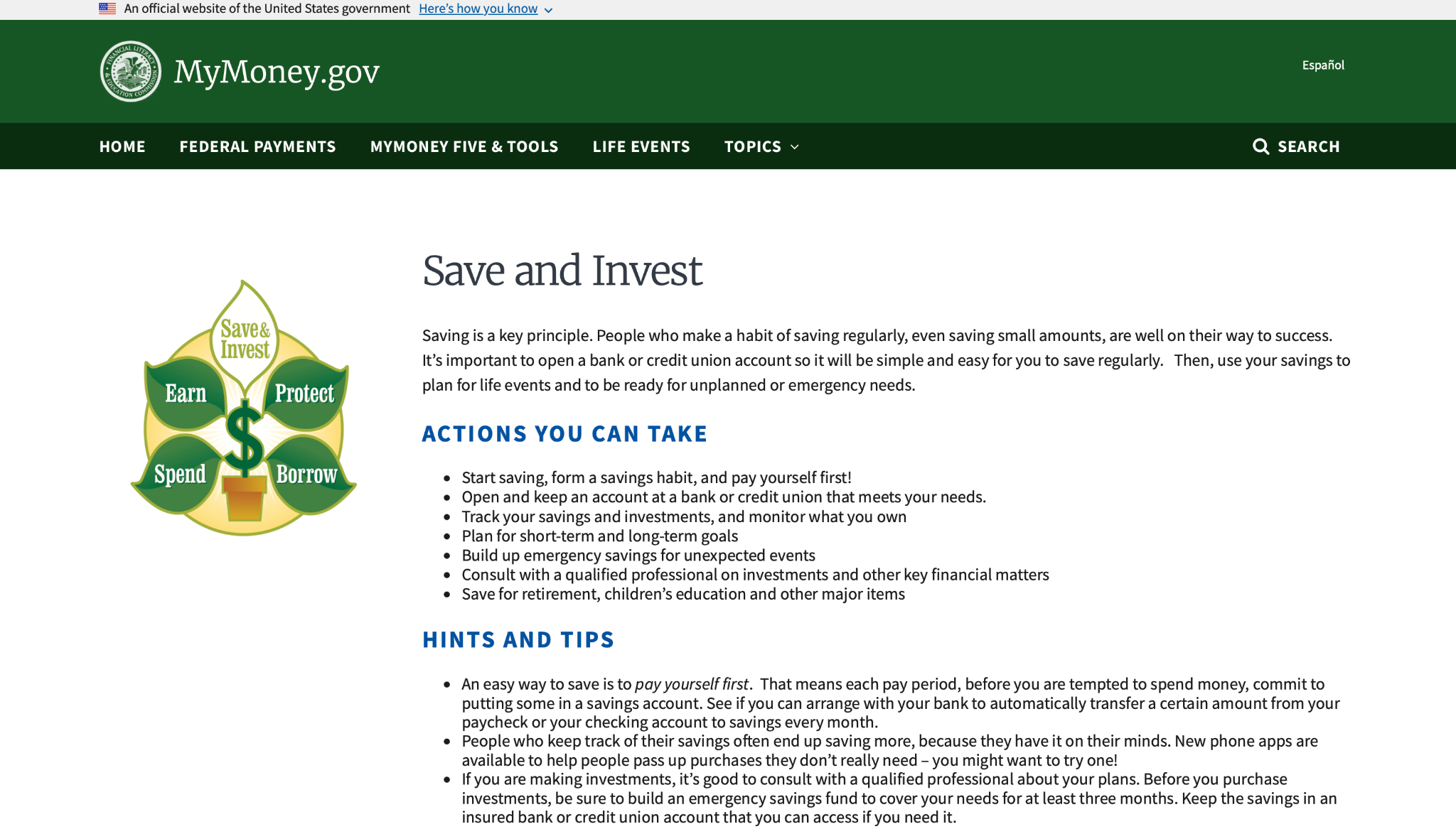
Each page of the MyMoney Five principles has two headings: "Actions You Can Take" and "Hints And Tips". While this does immediately communicate what a user can do, it does little to help users understand immediately how they could do that.
"Start saving, form a savings habit, and pay yourself first!" is good advice in the "Actions" section but it says nothing about how a user could achieve that. Instead, that "how" is buried under the "Hints" section, so the user is having to jump between sections and infer connections. This massively increases cognitive load for a user already unfamiliar with finances.
Navigation Requiring Excessive Backtracking
There was no way for users to jump between the different MyMoney Five principles within the pages for each principle. Users are forced to backtrack to the "MyMoney Five & Tools" primary page to explore other principles. This introduces a lot of friction in the navigation experience, especially for someone looking to learn about finances from scratch.
Dense, Uninspiring Text
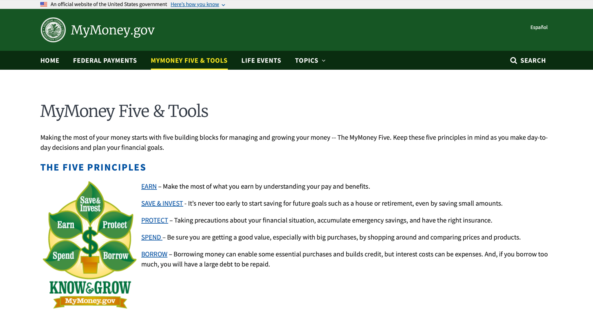
A lot of the text ends up restating similar ideas, or simply could be punchier for a greater emotional effect. As an example, while "It's never too early to start saving for future goals such as a house or retirement, even by saving small amounts" gets the idea across, having "saving" twice in the same blurb, and specifying specific saving goals, bogs down how quickly a user can react to the core principle: saving the smallest amounts counts.
Defining User Need
Before starting on any solutions, what exactly should be achieved needs to be clear. I needed to understand what role I wanted the "MyMoney Five & Tools" section to play in the larger "MyMoney.gov" ecosystem.
I concluded that the "MyMoney Five & Tools" section's main purpose should be to encourage people to empower themselves with financial knowledge. It is essential to recognize that a few webpages aren't going to make anyone financially literate. Instead, these pages intend to encourage user's first steps towards financial wellness.
Design Principles
With encouragement as my north star, I came up with two principles to guide my content redesigns:
Positivity - Finances can be intimidating, it's important to adopt a can-do spirit in my language to emphasise progress rather than complexity.
Actionability - People can see through empty words easily. Giving users next steps, ideally ones they can do almost immediately, goes a long way in preserving momentum to learn and affirming their agency.
Key Solutions
UX Writing
I rewrote the financial concepts and actions presented in the website to feel more approachable and actionable.
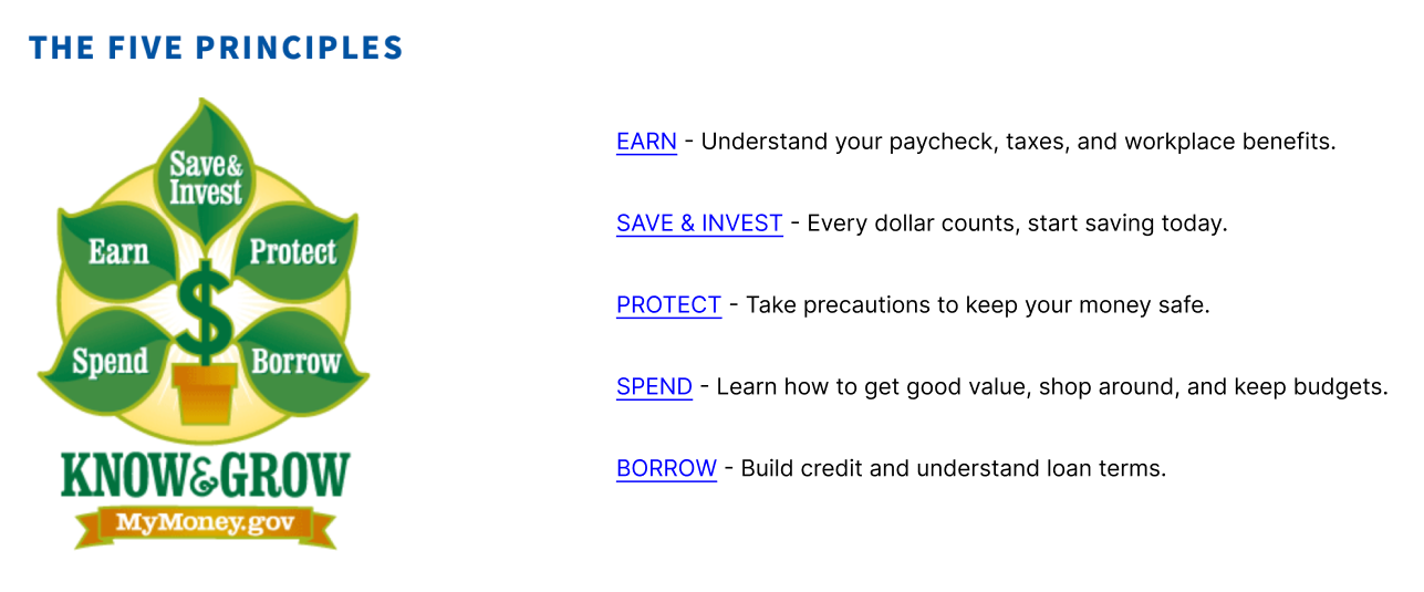
This lets users emotionally latch onto the core idea quicker, while still being sufficiently explanatory enough that users can start to imagine actions they could take to put the principles into practice.
Navigation
Smooth navigation will serve as the foundation for my goals. No matter how well designed the content, if users feel frustrated simply trying to get there, that'll sour their experience.
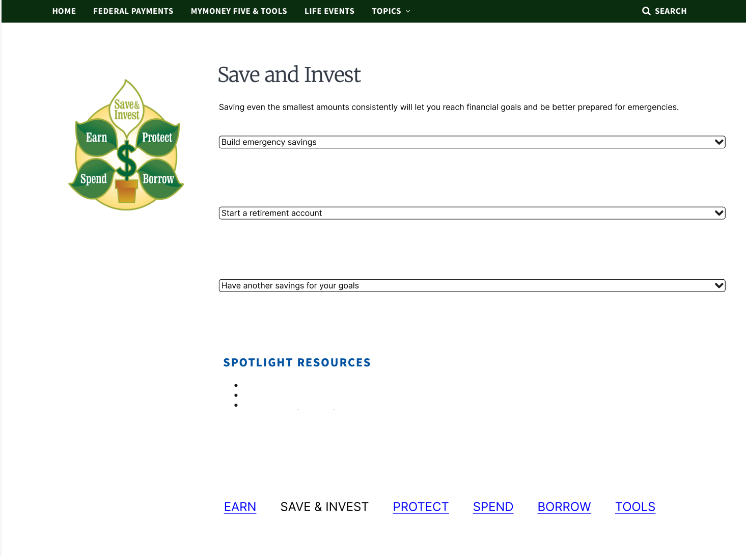
I added links to the MyMoney Five principles and the tools pages at the bottom of every page. This lets users simply scroll down to check out the other pages in this section rather than having to return to the "MyMoney Five & Tools" principle page each time.
Reducing Cognitive Load
To help users understand complex financial topics, I decided to switch to a topic based IA.
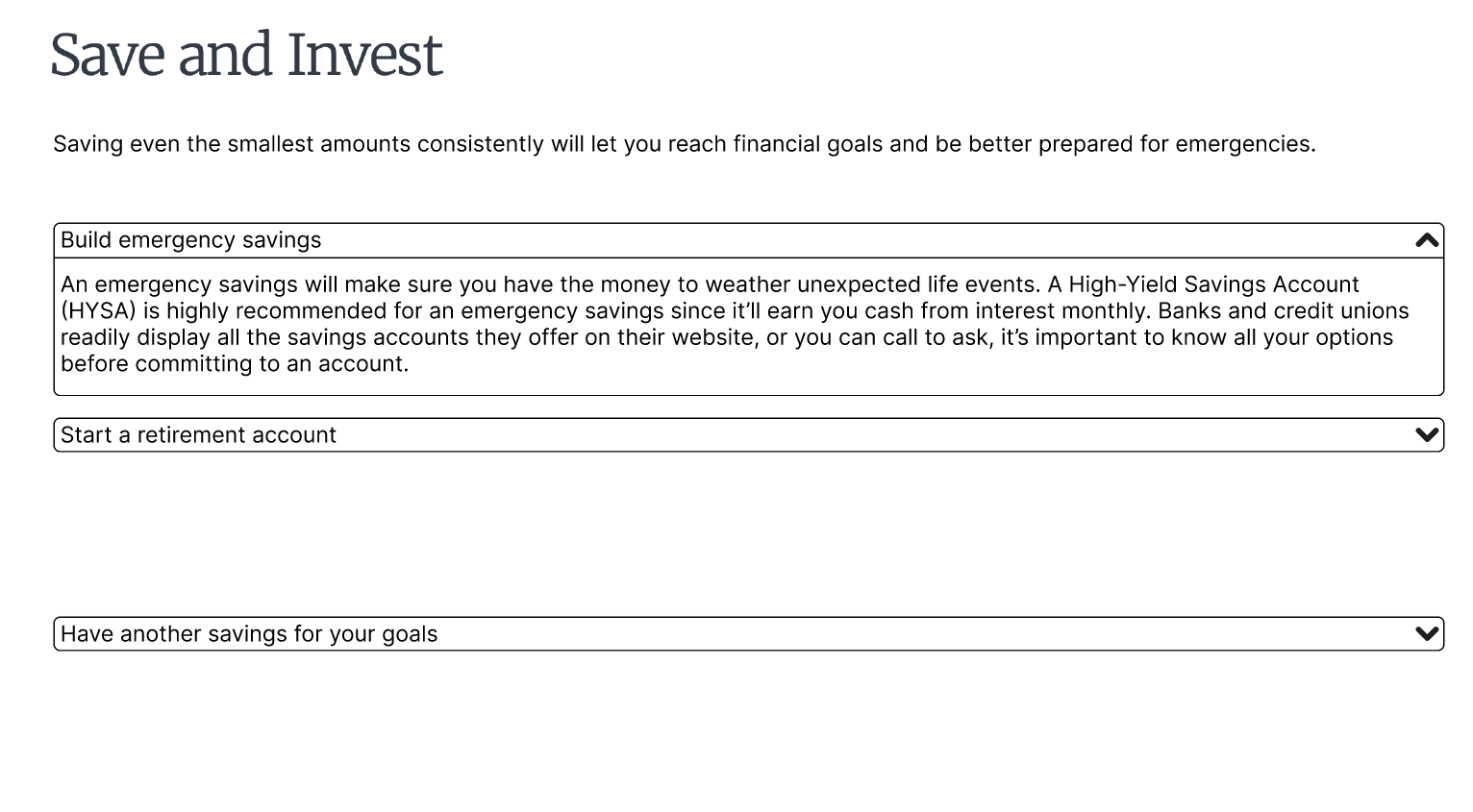
This allows users to learn one thing at a time, unlike before where different aspects were jumbled under the same "actions you can take" and "hints" sections. The topics are presented as clear subheadings, users can click on to expand and show informational text. This allows each user to pick what they need to see without crowding the page with all the text present.
Creating a Consistent Experience
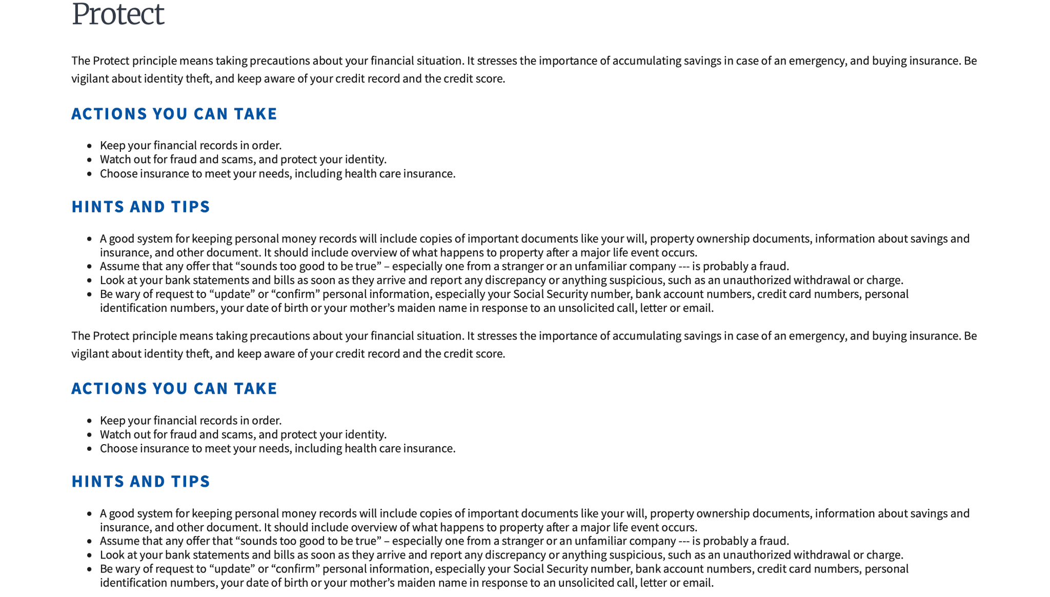
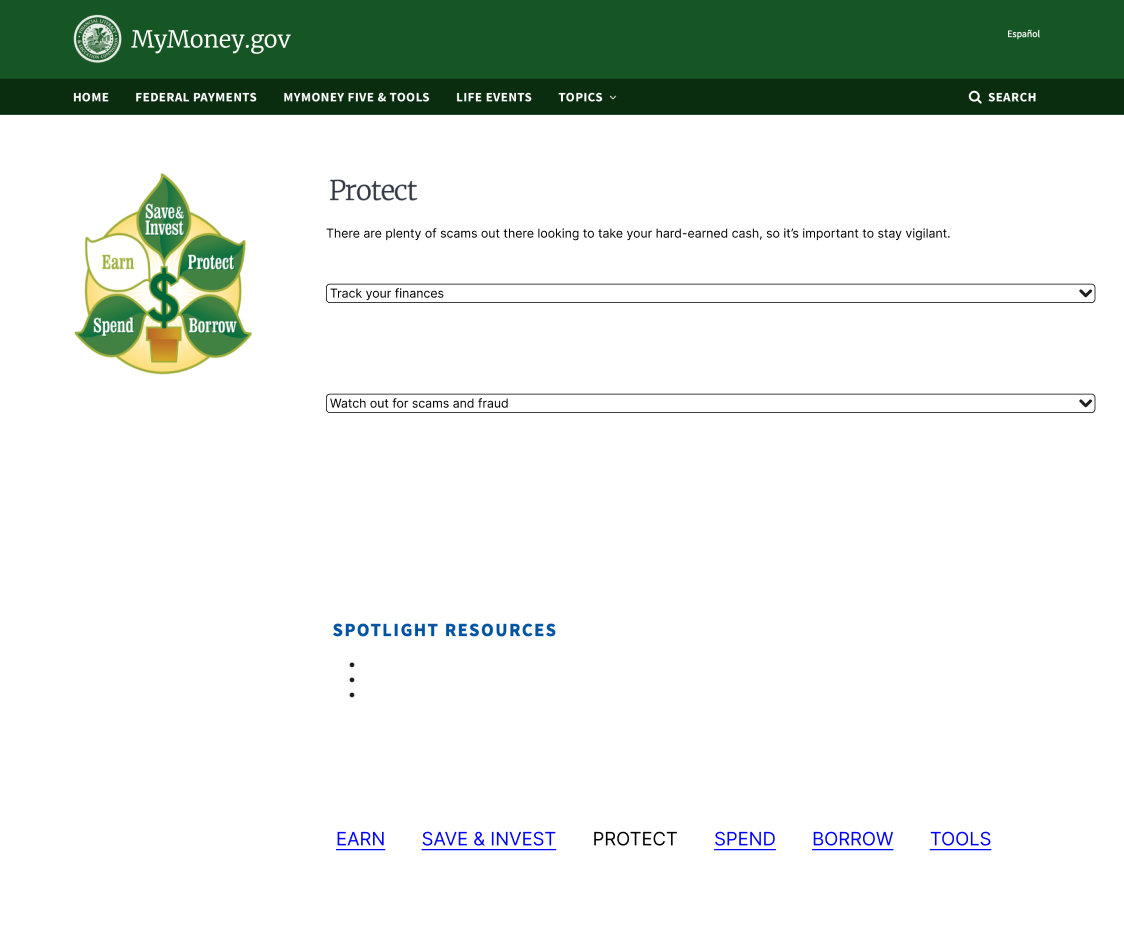
Layouts and content organisation were standardized across pages to enhance readability and predictability. Existing content issues, such as duplicated sections and missing graphics, were also resolved.
Before:
After:
Constraints & Future Opportunities
Spotlight Resources
In my original conceptualization of this project, I had an idea to curate the resources displayed in the tools list, and refine the ones highlighted under each MyMoney Five principles page.
However, I ultimately decided to leave it blank because I believe this task is much more effectively done with a team. The scope of this task is necessarily large, to ensure the best resources are selected and it should require a comprehensive audit of all available government financial education resources.
Not only would the timeline for this be long, the best results would come when different perspectives and opinions weigh in on which resources are most suitable.
AI-Assisted Tool Search
I had lightly integrated into my final hacked prototype by including an AI Chat that linked to the Tools page.
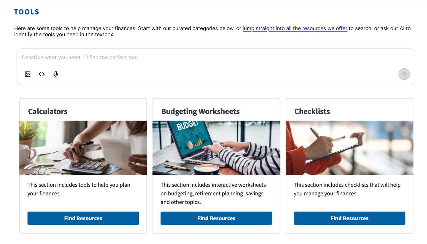
Financial language is far from widely known, especially for the users who have just started learning. They may not know the exact words to use when searching through the tools and resources for something that could help them. With a simple word-matching search, users could miss tools and resources that could've helped them.
Here, an AI search can be helpful for interpreting a user's input about what they need and then suggesting appropriate tools and resources.
Final Hacked Prototype
This final prototype brings together all my navigation, content, IA, and layout decisions described above.
Explore it here!
Reflection
This project helped me see the importance of defining a product's purpose before designing anything. Reframing from "teaching finance" to "encouraging financial learning" allowed me to see this website in a new angle and consider what would have the most impact for people that would be seeking out resources this way.