Graphic Design Highlights
Role: Lead Designer
Tools: Canva
Nominating Alpha Gamma Pi Officers (November 2024)
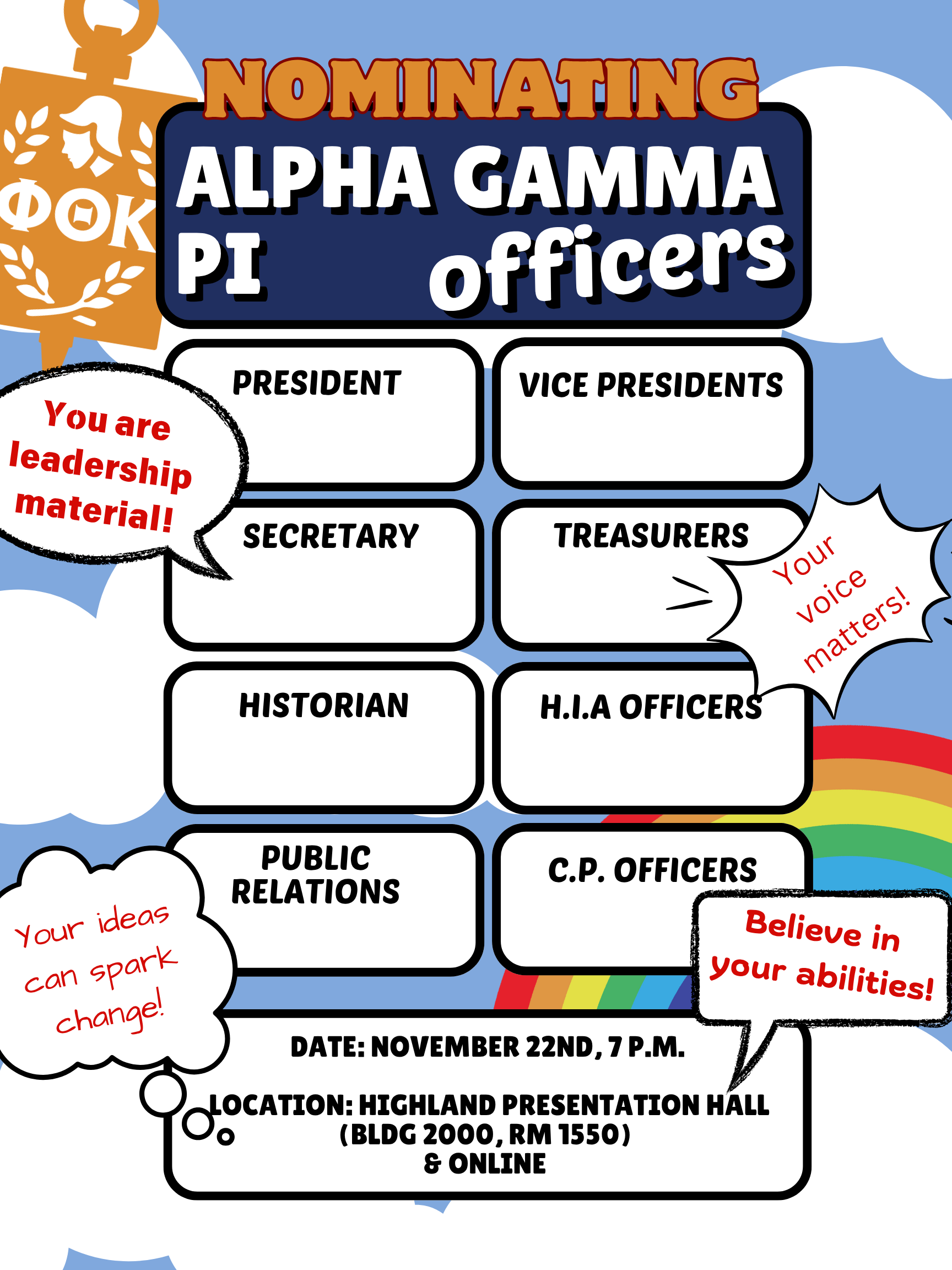
Organization: Alpha Gamma Pi Chapter of Phi Theta Kappa
Goal: Create a poster that will encourage organization members to step up for leadership positions.
As the semester came close to its end, it was time for the organization to nominate new student officers. This can be an anxious experience for our members so we wanted to create a poster that encouraged them to step up to leadership positions in the organization.
The background depicted bright blue skies with white clouds and rainbows to give off a feeling of hope.
This brightness was balanced by the jewel tones of the official PTK colours, which were incorporated in the title to still give a sense of professionalism.
The officer roles up for nomination were then designed akin to name tags, with ample space below the titles to say "your name could be here!".
The poster was then rounded off with different speech bubbles saying encouraging messages in different fonts, suggesting a sense of inclusivity, that anyone was welcome into leadership in our organization.
The details of the meeting were then added to the bottom of the poster, a more unusual choice, but most of our members had been well aware of where and when we met every week by that point.
That night, we had a high number of self nominations and memorable speeches from candidates. A lighthearted approach was exactly what helped us achieve our goal of encouraging participation.
This taught me the importance of knowing what design goals to prioritize and how that can differ with context and setting.
Ghostly Gala (October 2024)
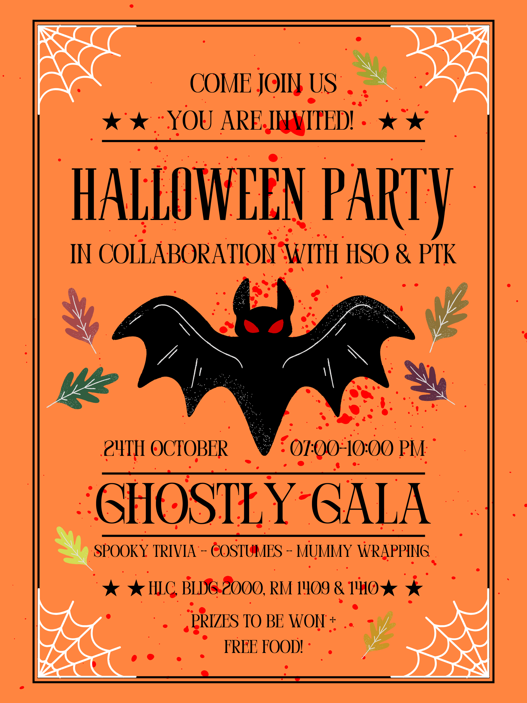
Organization: Alpha Gamma Pi Chapter of Phi Theta Kappa
Goal: Create a striking Halloween themed poster that catches attention to this fun event.
We wanted a poster that embraces the halloween spirit while keeping all the fun activities and essential details front of mind. Our target audience was any student down for some fun so seasonal vibes while being informative was imperative.
An orange background with bats, fall foliage, and spider webs were all classic motifs of a halloween theme, it lets people know what this poster was about before even reading anything.
A serif font with its structure and sharp edges added to the intensity that compliments the spooky vibe.
All the activities for the night were then added just below the event title, showing all the fun you could have participated in if you attended.
Finally, one last detail I personally added were small bright blood splatters throughout the canvas. Red is always an eye-catching colour and it added much needed sense of dimension to the otherwise orange dominated poster while not distracting from the essential information.
The Halloween party was packed, and attendees mentioned how the blood splatter detail caught their eye and made the poster memorable.
This taught me how even little changes can really elevate a design's depth and audience reception.
Scholarship Stay-In (September 2024)
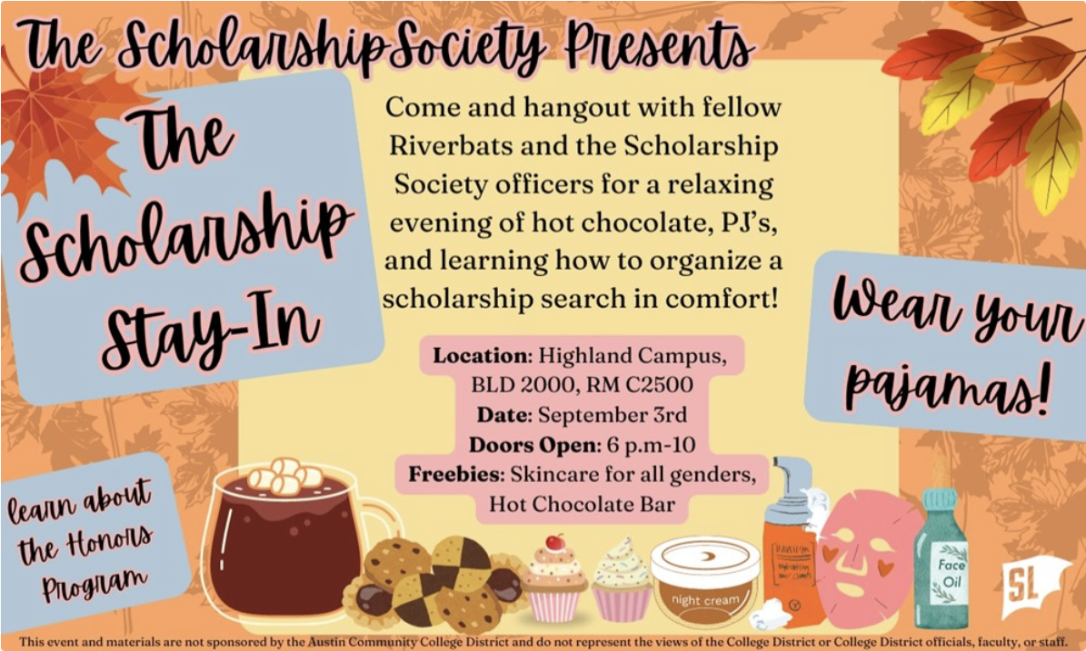
Organization: The Scholarship Society (TSS)
Goal: Create an inviting event poster that encourages attendance.
We were amining for cozy and seasonal while still communicating essential details. Any student was welcome so communicating where and when was essential while still keeping it fun.
I emphisized the transition into fall with the use of oranges, yellows, and pinks.
The periphery used autumn leaves and faded foliage in the background, which give a softer and more seasonal tone, while solid colour blocks highlighted essential information like date and location.
Making the graphics and typography lean more playful creates a sense of approachability, and including small illustrations of food and skincare products made the freebies we offered more tangible and appealing.
Final touches included adding the disclaimer and "Student Life" logo required for all student organization marketing materials.
This Stay-In saw one of the highest attendance for an event, with all of our seats full plus some.
This taught me how to coordinate a visually striking yet on-theme colour palette, how clear hierarchy can guide eyes, and how design can create a friendly tone.